
Designing a three-lane endless runner for keyboard and touch
A three-lane runner refined for readable lane changes, jumps and slides on keyboard and touch.
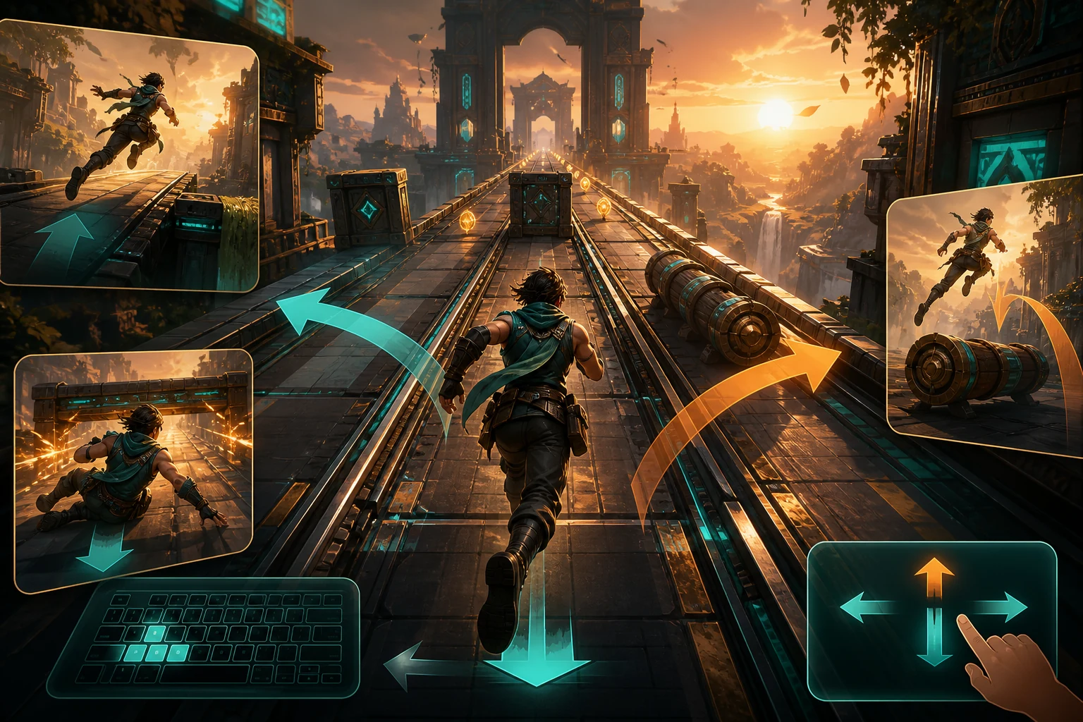
The promise of a three-lane runner
A three-lane endless runner looks simple because the player has only a few actions: move left or right, jump, slide and decide when a coin is worth the risk. That limited vocabulary is exactly why every detail matters. When the game is fair, a player reads the track, commits to an action and understands the result. When it is not, obstacles merge into the background, inputs arrive too late or the camera hides the safe route.
For the creator upload Endless Runner, the review focused on preserving that readable decision loop across keyboard and touch. The build already contained a first-run help panel, two speed tiers, score and distance counters, coins, moving threats, pause, restart and a stored best score. The work was not to invent a different game. It was to verify that the existing design communicates its rules and responds consistently.
Lane changes must be discrete and predictable
The player should always know which of the three lanes is active. A left or right command moves exactly one lane unless the character is already at the edge. Repeated key presses cannot queue an invisible extra movement that fires later. The animation may ease between positions, but collision logic must agree with the visual position during the transition.
On desktop, the runner accepts the arrow keys as the primary convention and also supports A and D. On touch, a horizontal swipe maps to the same single-lane decision. The swipe threshold needs to ignore small scrolling motions while still feeling immediate. Visual movement, collision state and camera framing should be driven by the same lane index so a narrow mobile viewport does not create a different rule set.
Jump and slide need readable contracts
Jumping and sliding are not interchangeable escape animations. A ground barrier asks for a jump; a low overhead barrier asks for a slide. Each obstacle needs enough contrast, advance visibility and consistent height for the player to identify that contract before the input window closes.
Keyboard players can use the up arrow, W or space to jump, and the down arrow or S to slide. Touch players use vertical swipes. The help screen must state these controls, but the track itself should teach them through early, isolated examples. Combining a lane change with a jump can be exciting later; using that combination before the player understands the silhouettes feels arbitrary.
Difficulty should compress time, not remove information
The first tier acts as a warm-up and gives the player a five-hundred-metre objective. The second tier raises speed and obstacle density toward a fifteen-hundred-metre target. Increasing difficulty by shortening the decision window can work, but the game must preserve visual information. Faster play needs cleaner spacing, stronger silhouettes and disciplined combinations rather than a wall of random objects.
Coin lines are useful as soft guidance. They can reveal a safe lane or invite a calculated detour, but they should not lead directly into an unreadable collision. A fair system lets a skilled player anticipate patterns while retaining enough variation for replayability. Survival remains more important than collecting every coin.
Mobile layout is part of game design
A desktop screenshot does not prove mobile readiness. The protected preview was tested at a narrow phone viewport with the first-run help visible, then with the game started. Controls, status counters and pause actions had to remain readable without horizontal scrolling. Touch handlers were reviewed for all four directions, and the ordinary embedded mode remained playable without forcing fullscreen.
The surrounding Malaguo page also matters. The play area must reserve a stable ratio, the fullscreen control must remain reachable, and share or report actions cannot cover the game. A mobile browser adds its own address and navigation bars, so safe spacing needs to tolerate less vertical room than the nominal screen size suggests.
What the review accepted
The candidate build started successfully after its deliberate first-run help screen. Left movement and jumping responded to keyboard input, distance and score advanced during play, and the browser console stayed clean. Mobile layout and swipe handlers covered the same action set. The catalogue copy was expanded so players understand the two objectives, moving train risk, best-score persistence and exact controls before launching.
Approval does not mean the design can never improve. Future versions can add better onboarding telemetry, more authored pattern sequences, accessibility options and richer sound. It means this named version delivers the mechanic described on its page, on the devices it claims to support, without hiding a broken route behind a public link.
A checklist for runner creators
Test lane boundaries, rapid opposite inputs, jump and slide recovery, pause during motion, restart after collision and first-time help persistence. Verify every keyboard label against the code. On touch, test short and diagonal swipes, browser scrolling and the smallest supported viewport. Finally, play long enough to reach the higher speed tier. A runner that works for the first twenty seconds may still fail when timing, spawn density and animation overlap under pressure.
Conversation 0
Sign in to join the conversation.
Start a thoughtful conversation.