
Building a fair seven-slot triple-match puzzle
How layers, a seven-slot tray and limited tools create a fair farm puzzle with clear choices.
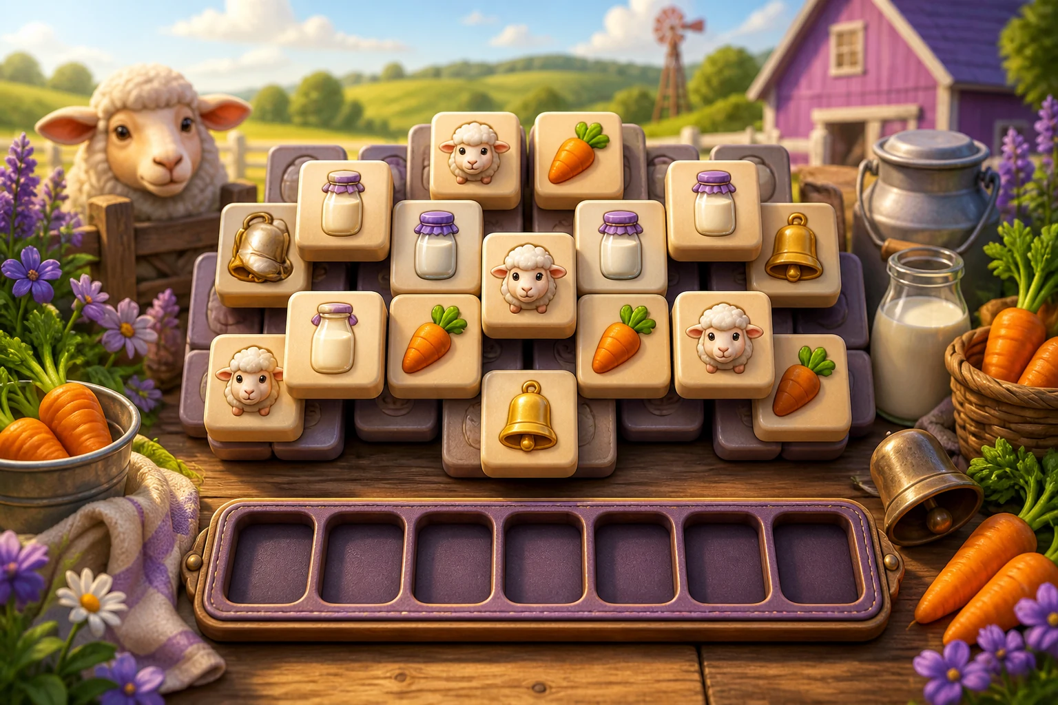
Why the seven-slot tray creates tension
In a layered triple-match puzzle, the player selects an uncovered tile and sends it to a tray. Three matching symbols disappear, but unmatched symbols continue to occupy space. With seven positions, every click carries a small strategic cost. The player is not only finding matches; they are deciding which future tiles a move will reveal and how much temporary variety the tray can safely hold.
That tension is strongest when the information is clear. A player should lose because a sequence of decisions filled the tray, not because a tile looked available when it was still blocked or because the art changed identity at a different size. For the creator upload Farm Triple Match, the review concentrated on legibility, self-contained assets, progressive complexity and honest recovery tools.
Covered and available tiles need a shared visual language
The topmost available tiles should have the strongest contrast, cleanest edges and most confident response to hover or touch. Covered tiles can be dimmed or slightly recessed, but their symbols still need to remain recognizable so the player can plan what a removal might uncover. Shadows and overlap must explain the stack rather than decorate it.
Each symbol needs a distinct silhouette and colour relationship. Sheep, cows, chickens, rabbits, carrots, milk, wool, bells and fences should not depend on tiny text. The release packages every card illustration inside the game archive. This matters technically as well as visually: root-relative image links can work in a prototype and then fail inside an isolated production runtime, leaving blank tiles. Bundled relative assets make the approved version reproducible.
Early levels should teach release value
The first level uses fewer symbols and shallower layering. Its job is to let the player see that selecting one tile can release several useful choices. Obvious triples build confidence, while a small amount of temporary tray clutter introduces risk. The second level expands the symbol set and depth, asking the player to compare immediate matches with moves that open the board.
Difficulty should grow through relationships between layers, not merely through more visual noise. A dense board can still be fair when the player can inspect the overlap, understand the tray and form a plan. Random arrangements should be checked for solvability and for opening states that offer meaningful choices rather than a forced loss.
Recovery tools should create decisions
Undo, shuffle and move-out tools can rescue a session, but unlimited tools erase the tray's purpose. Each level therefore provides a limited supply. Undo is best for correcting a clearly understood mistake. Shuffle changes the available order when the visible route has become awkward. Move-out temporarily frees tray space and is most valuable when the player has identified the matching tiles they can uncover next.
The interface should show availability before the player needs a tool and explain what will change. A disabled tool must look disabled. Activating one should produce immediate feedback and update the same counters used by the underlying game state. Recovery is not a hidden purchase or an arbitrary continue; it is a finite part of the puzzle's strategy.
Mouse and touch should select the same target
The core action is a click or tap, so hit areas must follow the visible card rather than a smaller internal icon. On a phone, neighbouring cards need enough separation that the player does not select the wrong tile while scrolling. The tray and tool buttons remain visible without creating horizontal overflow, and the help, sound, language and pause controls stay reachable at the top.
The review started a real session, selected available cards and confirmed that slot and remaining-card counters changed. It also found two release blockers that static metadata could not reveal: some help buttons exposed internal translation keys, and card images pointed to paths outside the uploaded runtime. The corrected 1.0.1 build maps every interface element to a public label and bundles twelve original farm card assets. A fresh archive scan reports no external URLs, no escaping root paths and no network capability.
Localized instructions must match the mechanic
The public page now explains the seven-slot limit, automatic triple clearing, layered unlocks and the three tools. That information is localized into ten market languages after the source build is approved. The game's own language picker remains useful during play, but platform metadata cannot assume that an English fallback is acceptable on a Japanese, Korean or French URL.
Search descriptions focus on what a player can actually ask for: a free triple-match puzzle, farm tile matching, touch play and no download. The original title remains visible as the game's identity, while the page description supplies the mechanic and intent. Screenshots show the approved game with its real tiles instead of unrelated promotional art.
A checklist for puzzle creators
Test every opening seed, tray overflow, automatic clear, final tile, win state, undo boundary, shuffle state and pause or restart path. Resize the game until symbols remain distinct at the smallest target. Disconnect the network and confirm that every required image, sound and font still loads. Then ask a new player to explain why a tile is available and what each tool will do. If the answer depends on guessing, the puzzle needs clearer information before it needs more content.
Conversation 0
Sign in to join the conversation.
Start a thoughtful conversation.